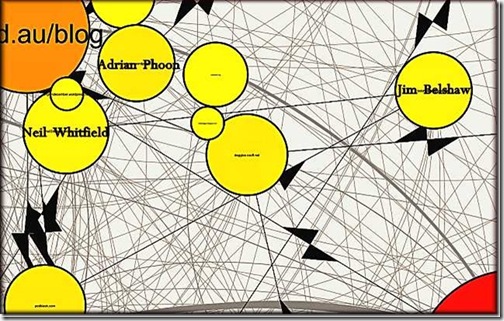
Thursday this week, Neil (Ninglun) ran a post, Blogging–a side-track, that I found quite distracting. Why distracting?  Well, it included this excerpted graphic showing relationships between some blogs in the immediate neighbourhood. Neil has added names over the URLs.
Neil's post then led me to a post by Dr Axel Bruns, First Steps in Mapping the Australian Blogosphere. This includes maps of linkages across the Australian blogosphere.
To generate the maps, Dr Bruns took the period 17 July to 27 August 2010 and then mapped the links (2.3 million) between the 8,300 blogs they are presently following. This includes some newspaper sites. This generated a map of blogs and blog relationships; sites that didn't receive at least three links during the period were excluded.
Dr Bruns is careful to make clear that the work at this stage is partial. For example, only 8,300 blogs are included, with a bias towards the political, while the data needs to be cleaned. Still, it's an interesting snapshot.
Like all bloggers, once I knew I was there, I started by finding this blog, then looked for others. This was a clunky process, given my screen size. I had to constantly reduce and enlarge in my efforts to track across the maps. In doing this, I was helped in by my knowledge of blogs. This made it a little easier to interpret. Well, what did I find?
Dr Bruns is, of course, correct about the partial nature of the sample. I couldn't find Skepticslawyer, for example. A rough check found six links to this blog in the period, of which two came from me! I suspect the sample is also short on business or professional blogs, while the three link requirement conceals smaller networks, history blogs come to mind. There is also an issue here that some networks are mixed in that they include overseas sites.
Accepting these qualifications, I found the type of political clustering that you might expect, broadly reflecting party and left/right affiliations. For example, on the left Larvatus Prodeo, John Quiggin and Club Troppo are major, somewhat overlapping, nodes, each with their own if linked clusters. On the other side of the fence, Catallaxy has a similar but smaller cluster.
The Crikey group of blogs forms another node/cluster in its own right.
One of the things that leads to heavy clustering of all the political blogs into a mass of hard to read colour is, I think, the presence of cross-quoting. This groups the left, left-centre blogs most closely, but also pulls the right, right-centre blogs somewhat together towards the left blogs. I am sure that this can be analysed further from the data by taking individual nodes and then looking at the relationships between them.
Visually, and we are talking links not traffic, left and left-centre blogs dominate the Australian political blogging environment. There are more of them, while cross-links are common. I guess that this would fit common perceptions.
Looking at the map grouping blogs by colour, political blogs are light green. Neil, Adrian and this blog are classified as political blogs. However, we (and this blog in particular) appear on the map as out-riders, somewhat remote from the main political cluster and independent of any of the key political nodes. I guess that's what we are too.
The tools that Dr Bruns and his colleagues are using are obviously quite powerful. I am going to be very interested to see how all this evolves. I probably know the linkages and patterns around our own immediate blogging world quite well, but the research helps set this in a broader context.


No comments:
Post a Comment